")
Rebranding from StyleWise to Clergy Closet
I had been thinking about rebranding StyleWise for years. At one point, I asked my Instagram followers if I should change the name to just my name: Leah Wise. But to do that, I would have had to commandeer my preexisting domain, leahwise.com, which I use to share sermons and other theological writings.
It didn’t feel like the right move to combine my more serious, “professional” work with something that was intended to be a diversion from the heaviness of ministry.
So StyleWise lay essentially dormant for two years. Finally, on a bit of a whim, after some serious soul searching and a reorientation to my work, I spit out another Instagram poll.
This time, I had the idea that StyleWise could retain its essential theme while better reflecting my current focus and identity. I still care about slow fashion and sustainability, but I try to have a less puritanical relationship to it. These days, I’m trying to live my values while bridging what sometimes feels like an impossible divide between personal style and a clergy uniform.
I asked followers whether I should rebrand to Clergy Closet, Priest Style, or Style Sacristy. Unsurprisingly, only clergy liked the last one (it’s niche). One friend recommended Woman of the Cloth, which I liked, but the domain was already taken.
Clergy Closet was the clear winner, and the domain was available and only $13 a year!
The Meaning Behind the Logo
Before launching, I needed a new logo. So I did what anyone would do: I signed up for another free trial of Canva and got to work.
I thought I would spend some time introducing the logo and dissecting the meaning behind each color, font, and object…
Dissecting the Clergy Closet Logo
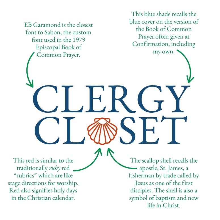
Font: EB Garamond is the closest font to Sabon, the custom font used in the 1979 Episcopal Book of Common Prayer.
Blue Text Color: This blue shade recalls the blue cover on the version of the Book of Common Prayer often given at Confirmation, including my own.
Ruby Red Color: This red is similar to the traditionally ruby red “rubrics” which are like stage directions for worship. Red also signifies holy days in the Christian calendar.
Scallop Shell: The scallop shell recalls the apostle, St. James, a fisherman by trade called by Jesus as one of the first disciples. The shell is also a symbol of baptism and new life in Christ.
Line Height: The line height between the words Clergy and Closet is intentionally narrow to replicate the cover page design in the 1979 Book of Common Prayer.
It sounds kind of complicated, but it was a ton of fun and didn’t take too much time to put together.
At first, I tried to bring more fashion imagery into it (like a hanger), but once I spun the shell around to mirror the symbol of Spain’s Camino de Santiago (Way of St. James) pilgrimage, I realized it looked a bit like a dress.
The scallop has become particularly meaningful to me as a symbol of Christian faith. There are lots of ways to think about its significance. The connection to water recalls the Spirit of God hovering over the watery deep at creation and the the breaking waters of new birth.
Themes of birth and creation connect directly to the sacrament of Baptism, as the candidate goes down into and rises out of water as sign of death and resurrection. Many congregations, including mine, use a little silver scallop shell to draw the water from the baptismal font.
As a nod to St. James, it reminds me that Jesus called the poor and powerless to his work of reconciliation. And beyond symbolism, living scallops, though small, are a vital part of their marine ecosystem.
This logo was a labor of contemplation I didn’t realize I needed. Thanks for coming along for the ride.